|
Process images.
|

How I approached this piece of art work was that I gave it like a cartoonish affect. I wanted to create a motion like formation so that you would have all aspects of the picture to look at. I wanted to play around with nature like qualities so I used a lot of nature similar qualities such as the flower buds and the cracked earth. The piece is not connected because I wanted you to see action taking place. This piece resembles my favorite powerpuff girl (bubbles).
|
This project let me become a little more free. It was very interesting trying to come up with and idea about this project so I finally made a storyline for it. I really like the simplicity of it and the ongoing laughter you can get from it. This was my best project to me by far.

How I went about this piece was that I started off weak just to finish off strong. I made sure that there was a lot of contrast so that the pieces looked like it was something going on. I added a lot of different textures to show some depth and made sure that I transitioned the image through these five pieces well. Overall I like this pictures transitions.
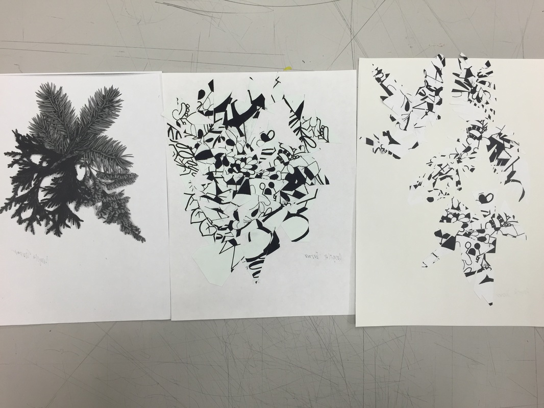
For this art work I went about it a different way and mashed a bunch of cut up pieces together on a sheet of paper. Also for the final piece I chose to make it resemble the leaves from the first picture. I liked the abstract feel of it and how it is still somewhat similar to the shape of the original picture.


This was a fun project to bring out some of my cartoonish personality. It's very story book like (hints the back of the book, top left picture). The A on the cover is representing my name. The Abstract design of the book looked very neat to me. The off the page style of some of the pictures really brought the book to life.

The color white has a very intriguing meaning behind it. It is often used as to represent purity, innocence, and virginity hence why brides tend to wear white dresses for their wedding. This project was full of mystery because it was hard to approach for me at first. Since my paper was already white I took an off white and used it to that it can be shown. The bird stood for purity, and the snowflake gave the page some sort of depth. The pale blue text seemed to ft with the purity of it all.


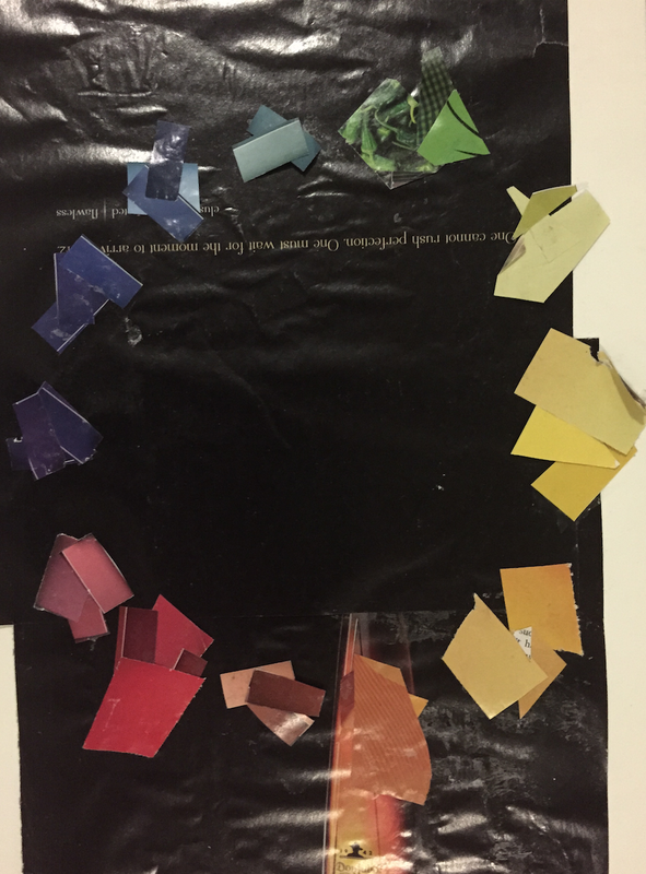
This Pattern Project was pretty simple. I tried to balance the darkness with the light by splashing it all in one corner! Overall this project was fair.
Green- Relaxing, often used in hospitals to calm down patients, center of the color spectrum.
Blue- Known to be relaxing, used a lot in social media such as Instagram and Facebook, and was originally said to be the color for girls back in the day.
White- In heraldry, white represents faith, Color of purity, In advertisement its used for cleanliness and coolness.
Orange-Representation of Caution, friendliness, also it represents Buddhism
Red- Representation of Power, holds a wide variety of emotions, and men and women see the color red differently.
Purple- Its a representation of calmness, snails with purple snot were harvested to make purple dye, and it is a very hard color to obtain.
Grey- Its the best complimentary color for other colors, it represents all things just, and its a very neutral color.
Black- Represents stability and power, there isn't a symbol of it in existence, and it absorbs all other light waves.
Yellow- Representation of joy, all of the planet contains yellow pigment that protects the plants, and also is the brightest color
Pink- Considered a positive color, was originally considered to be the color for boys back in the day, and represents compassion.
Violet- Represents wealth, a very distracting color, and it can also represent death or sorrow.
|
Self Logos
|
Trip me im dreaming blue, Pitiful purple, Numb Nerves Green, Broken Thumb Red
This very intricate place harshens with a solid modern color. These colors scream pain but immolates a rich red of regret. Falling from the sky of the smokey light your fate has been sealed by broken pride of a lifeless limb. These colors scream of disaster as your face meets its maker! |
|